Monday, March 30, 2009

Illustration Friday, Different Strokes and Abstract Painting...

For this weeks Illustration Friday theme of "Poise" I decided to go with three drawings I did of the same model using three different mediums on three different substrates. The model looks to me as if she is dancing. Dancers and good models always have grace and poise.

The 18" x 24" drawing above was done with Conte chalk pastels on heavy brown craft paper.

The 11" x 14" drawing above was done with black and gray magic markers on drawing paper.

The 18" x 24" drawing above was done in charcoal on newsprint paper.

All three of the above drawings can be purchased at: http://www.absolutearts.com/pharecamp/additional-artwork/patricia-phare-camp-2.html
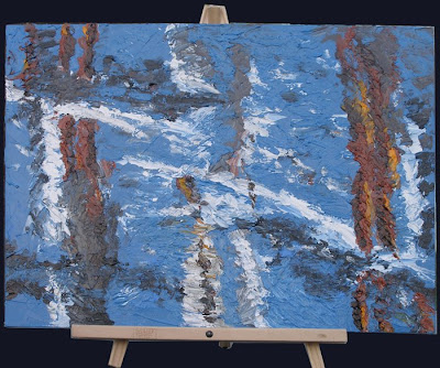
The painting above was done for my Abstract Composition class. Once again the photo for the Different Strokes From Different Folks painting challenge fits perfectly with the class assignment. This time the assignment was to paint a non-objective landscape and the reference photo is a landscape (see photo at the end of this blog).

It also reflects the wonderfully relaxing weekend I just had. The timing magically coincided with my return from a conference at a resort in Hunting Beach California. I was freshly glowing from being at the beach so I could paint the scene with my heart in an appropriate place.

This photo was taken by Karen Jurik, the moderator for the Different Strokes From Different Folks painting challenge. It's the challenge photo for artists to paint from during the two week period between March 18th and April 1st.

Thursday, March 26, 2009

Abstracted Landscape Sketches

The following pictures were done for the first landscape assignment in my Abstract Composition class. The assignment was to do a black and white sketch of a landscape. I did three sketches. I chose the reference photo for this sketch because it was a natural for abstracting. I also liked the element of repetition provided by the moon's reflection in the water. (see photo at the end of this blog entry) In each sketch i used different tools to achieve different stroke characteristics and experiment with using stroke direction and quality to affect mood.
I specifically wanted to create a dynamic and moody effect in the the above drawing so I used a Japanese calligraphy pen. This pen is like a fountain pen except that it has a brush tip (hair) rather than a nib. Its great for getting dry brush effects in a drawing as well as creating areas of dense blacks. (see the brush pen at http://www.danielsmith.com/products~sku~266+150+003.asp)

In the drawing above I wanted to create an energetic vibrancy with the brush strokes. here i used several variously shaded gray Tombow markers that have a simulated brush tip that is merely an extended felt tip. Not easy to get dry brush effects but nice for making marks of varying width. Denser areas were created using a brush of 80% shade and overlapping the strokes. (http://www.danielsmith.com/products~cat~350~sku~243+010+199~subcat~350203305.asp)

In the last one, pharecamp3 I wanted to create a serene meditative mood. Here i combined the use of the brush pen and the Tombow felt tips markers. I used 20-30% shaded felt tip marker sides to create broad horizontal strokes and overlapped the marks to create the water and sky. I used the same method on the denser shaded areas going back and forth with an 80% shaded Tombow marker and the brush tip pen.


The following picture is the reference photo I used for this assignment. It was taken by my husband on a birdwatching expedition. It was that recent crisp winter night when the moon was the closest to the earth that it would be all year...

Wednesday, March 25, 2009

Emperor Proofs

experimenting with the location of the strength archetypes. i like the above right one a lot.
My advisor likes the one on the above right the best, I also like it a lot.
the above left one is my favorite, if I did this I would make the floor gray and darker gray, but the adviser rightfully pointed out that it doesn't provide a sense of place and that you don't quite get the sense of passages as much in this as in the above compositions. Passages are important to me in this one...
We have emperor proofs. I don't like how the throne and the background merge. I was thinking of subduing the yellow but my adviser gave me a better idea.
what i will do is create a plate that i can print a chromatic gray glaze over just the back ground without effecting the foreground. This will also give a sense of space to the image. She also pointed out that I may want to make the eagle darker so it contrasts highly with the background.

Chromatic gray is a gray color created by mixing two complimentary colors (opposites on a color wheel [red/green, blue/orange, yellow/violet) or by mixing all three primary colors (red, yellow and blue). Varying the percentage of how you much you mix of each of the primaries you can get hues of brown, warm gray or cool gray.

I also noticed that the cut marks didn't print in the above proofs like it did in my keyline prints. this is because i used a larger brayer (ink roller). since the brayer is the size of the plate it doesn't dip down into the open spaces. I'm going to try a few color proofs using a smaller brayer on the black keyline so that I can see if the textural effects I like in the keylines below will translate well in the color whole...oh, oh-oh-oh, i just thought -- i will use a smaller brayer on the keyline to ink the chromatic gray glaze, use a stencil to block the foreground then use the larger brayer to roll black ink. Since the larger brayer wont touch the gray glazed cutmarks I'll achieve two shades on one block! I may not have to carve another plate after all...woo hoo! I had a plausible idear!

Friday, March 13, 2009

Featured Artwork

One of my works, A Maze Me, a 6" x 6" encaustic painting has been chosen to be part of the Featured Artwork rotation on the homepages at World Wide Arts Resources and absolutearts.com. The feature will be on 2009-03-13. The duration of the feature is one day and the rotation changes every few minutes. Please stop by at http://wwar.com and http://www.absolutearts.com and take a look at my featured artwork.

This is one of four 6" square encaustics. I've framed them in 8x8" shadow boxes and they look great grouped on a wall.


Top Left: Cosmology,
Top Right: I Give You My Heart,
Bottom Left: A Maze Me,
Bottom Right: Shooters

Wednesday, March 11, 2009

Empresses, IF and Different Strokes

We have and edition of Empresses

this week's block print fits right in with this week's Illustration Friday challenge. The theme is "intricate." This tarot card and the symbols within are definitely very intricate.

I like the way my Empresses came out. the colors worked great. As for the black overprint on the slightly larger cards...nah don't care for that but a ruler, a bone folder, a little water and some careful tearing will eliminate that...Next edition is the Emperor.


Current Different Strokes From Different Folks Challenge

The "Different Strokes From Different Folks" (http://differentstrokesfromdifferentfolks.blogspot.com/) painting challenge fit in perfectly once again with my Abstract Composition class. The mid-term for the class was to be an abstract of any still-life set-up of our choosing. The sushi photo for the Different Strokes challenge is of course a still life and sushi looks so abstract to begin with that I could take it even further...this really did become a challenge when I bumped the easel and all fell with the painting flat on it's face. I was able to take a pallet knife and smoosh goopy paint in the messed up areas to fix; although it did become a different painting afterward.

This is the photo for the Different Strokes challenge. It was taken by Karin Jurick; the moderator of the Different Strokes from Different Folks blog. These are obviously California Rolls sitting in shoyu; let me just paste what I wrote in an email about the subject matter:

"I have to say I love sushi, but California rolls are my least favorite -- why -- because most places don't make them right. Most places only put avocado and that fake crab in the roll; a true California Roll is supposed to have cucumber, avocado and REAL crab! Also it seems these days at every Japanese restaurant the combo meals come with fake California Rolls. They've become a flavorless cliche... "

Wednesday, March 04, 2009

Priestess Edition is almost there...

Started editioning the priestess. Got about 8 printed before I noticed the red cutmarks being picked up (see above card on the right) So out of 20 I've got about 12 to work with for an edition of 10. Not such good odds, may end up printing more in order to get a good edition. An edition is a set number of prints that are very very very consistent.

Here you can see why two of the same prints would not be considered an edition. There is a variation in the color between these two cards. For some reason the brayer (roller) didn't pick up and/or transfer as much blue ink to the printing block when I pulled the card on the above right. Variations like this occur because a human being is printing these images. If a machine were doing this, as in the pages of a magazine, then variations are an extreme rarity. When a human being does it clean consistent editions are not as easy.

Personally I like variations and usually consider minor variations to still be within an edition. But for a master's degree in printmaking my thesis project has to be full of good clean consistent editions. Simply because a master had better be able to know the difference and produce.

Because of the nature of the handmade paper these cards are being printed on there will be some variations that are unavoidable. these handmade papers with four deckled edges (jaggedy untrimmed edges) don't always have even or squared edges. Because of this some of the cards will have a slight border on the top and/or the left edge. (see the top of the right hand card on the very top of this blog)

Sunday, March 01, 2009

IF: Breezy


This is my entry for Illustration Friday the theme is "breezy." I didn't think I had an idea then I remembered the tiny daffodils in my window boxes, I'd just been telling my husband that they look like they're walking into a headwind...As I was working on this painting big gusty blustery winds started buffeting the windows, perfect music for painting a work in the theme of Breezy! Anyway, daffodils are a perfect subject for my submission to this week's Illustration Friday as it was almost exactly two years ago that I did my first Illustration Friday challenge and that one was the first daffodils of spring!


This is my painting for my homework in my Composition for Abstract Painting class. Well this one was a tough one. it was really hard for me to connect with the subject matter -- basically I felt nothing about it...so I simply jumped in and tried very hard to use the technique from the teachers demo...at a certain point I thought, "there is nothing else I can do with this and it sucks!" So I scraped off as much of the paint as I could, remixed completely new colors and started stabbing at the canvas, using the under-painting as a guide. Interestingly even though I didn't use the photo for reference in my second attempt the image still came out less abstracted than I'd intended.

Last night I was still less than thrilled with my effort, then this morning as I was cropping and sizing my photo of it I thought of the pot as a coffee pot, then I thought of the chilies and thought Mocha Mexicana with chili's and lemon -- uuuuuhhhhhmmmm!!!

combination of chocolate and chilies is an aphrodisiac you know! Now if I'd thought of that last night The painting could have gotten really interesting with all those vessels and peppers...

The little pictures below are the photos I did my paintings from. The coffee pot photo is from the Academy of Art class collection and the photo of the daffodils I took in my front yard. Its been really stormy and windy here in Northern California, perfect weather for photography!